
The first thing that catches one's eye is the "Breaking News" section on the website. This is displayed at the top of the page and contains the titles of all the latest articles. The list is presented in bullet point format with as few words as possible, which gives the reader an idea as to what the article is about, but does not complicate the page with a long description. These small text formatting details make the information easy for readers to navigate and understand. Along with text formatting, the website also makes use of graphics. The most obvious use of graphics is in the right column of the website's main page, which is where they provide graphs and charts of market activity. The use of charts and graphs makes the information easy to read. This would be much more difficult if the information were listed in simple text. The charts show the names of the markets on the left and the important variables along the top row.
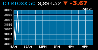
This is an example of the various visual effects that Bloomberg uses. This small graph conveys as much meaning as a lengthy paragraph. The information in the graph shows the price level of the stock and is updated each hour. At the top of the graph there is information about the stock that is color coded and boldly displayed. The text color and font size changes with the importance of the information. The current price of the stock is white, while the stock symbol is blue and bold. The change in price is in the largest font and displayed in either red on blue font, depending upon whether the stock prices falls or rises. The use of fonts, colors, and graphics allows the creators of Bloomberg to streamline their information deliver clear content to their users. This current writing s an example of the advantages that graphics provide. All of the information in this paragraph is also displayed in the graph above, but in a more convenient and easy to read format.
The graphic appeal of Bloomberg.com reaches farther than just the opening page. Clicking on one of the several tabs along the top of the page bring the user to different pages on the website. Under the "market data" tab there is a summary of all the important economic figures. These are subdivided into markets, currency, today's top funds, and commodities, and are highlighted in blue. The information under these headings are highlighted in white and blue alternately. This adds some aesthetic appeal and helps the reader to keep their place on the page.The overall layout of Bloomberg contributes to this purpose. The use of fonts, colors, and images makes the information understandable and easy to navigate.
No comments:
Post a Comment